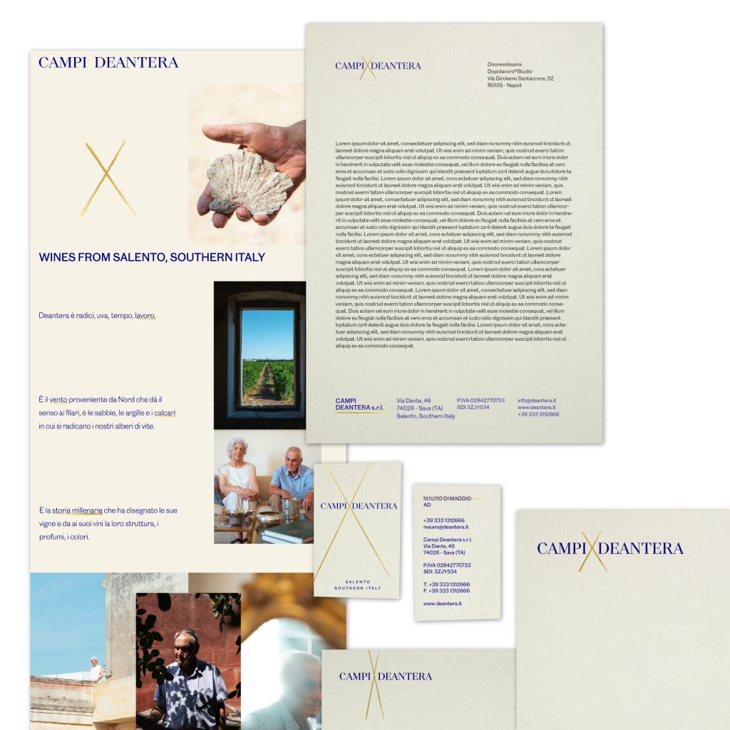
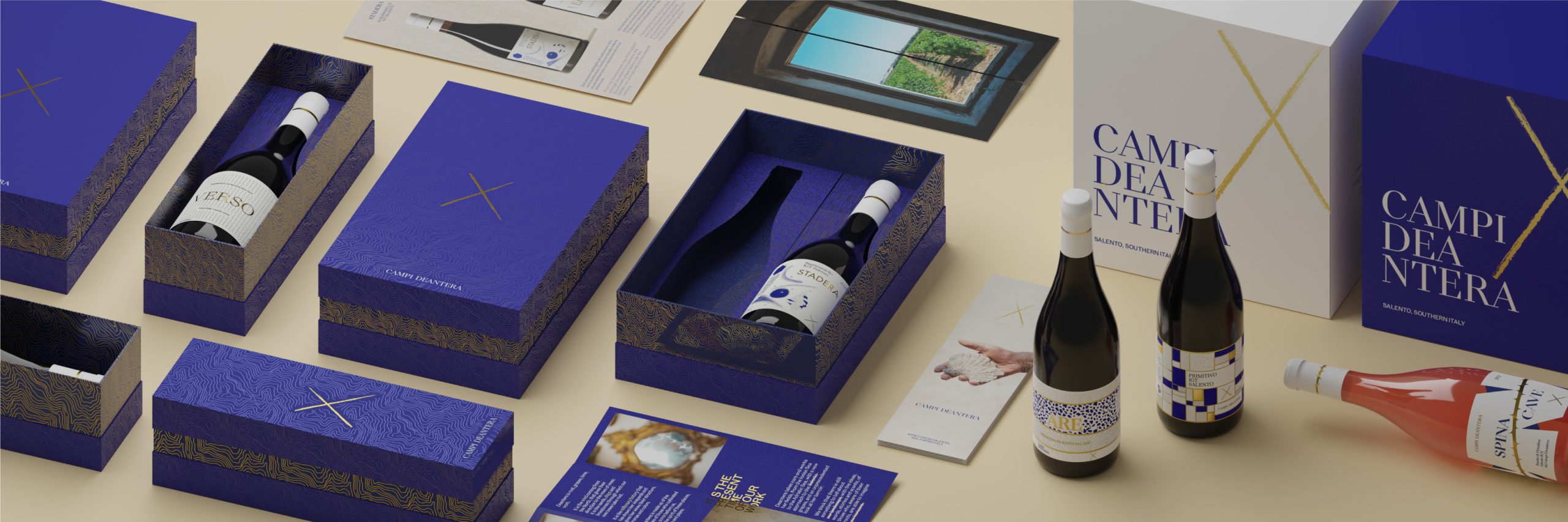
Campi Deantera
May 2023
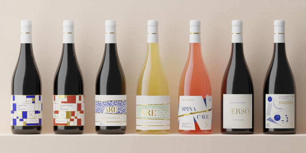
Since 2022, we started our first project of identity and packaging for a wine company.
In an industry where, for historical reasons, production and its marketing often belong to supposed birth nobilities with their Estates, Feuds, and Country Houses, with @campideanterawines the idea was to try to overturn the point of view.
No more Counts or Estates, but Fields, perimeters, and scenarios of another nobility, that of labor.
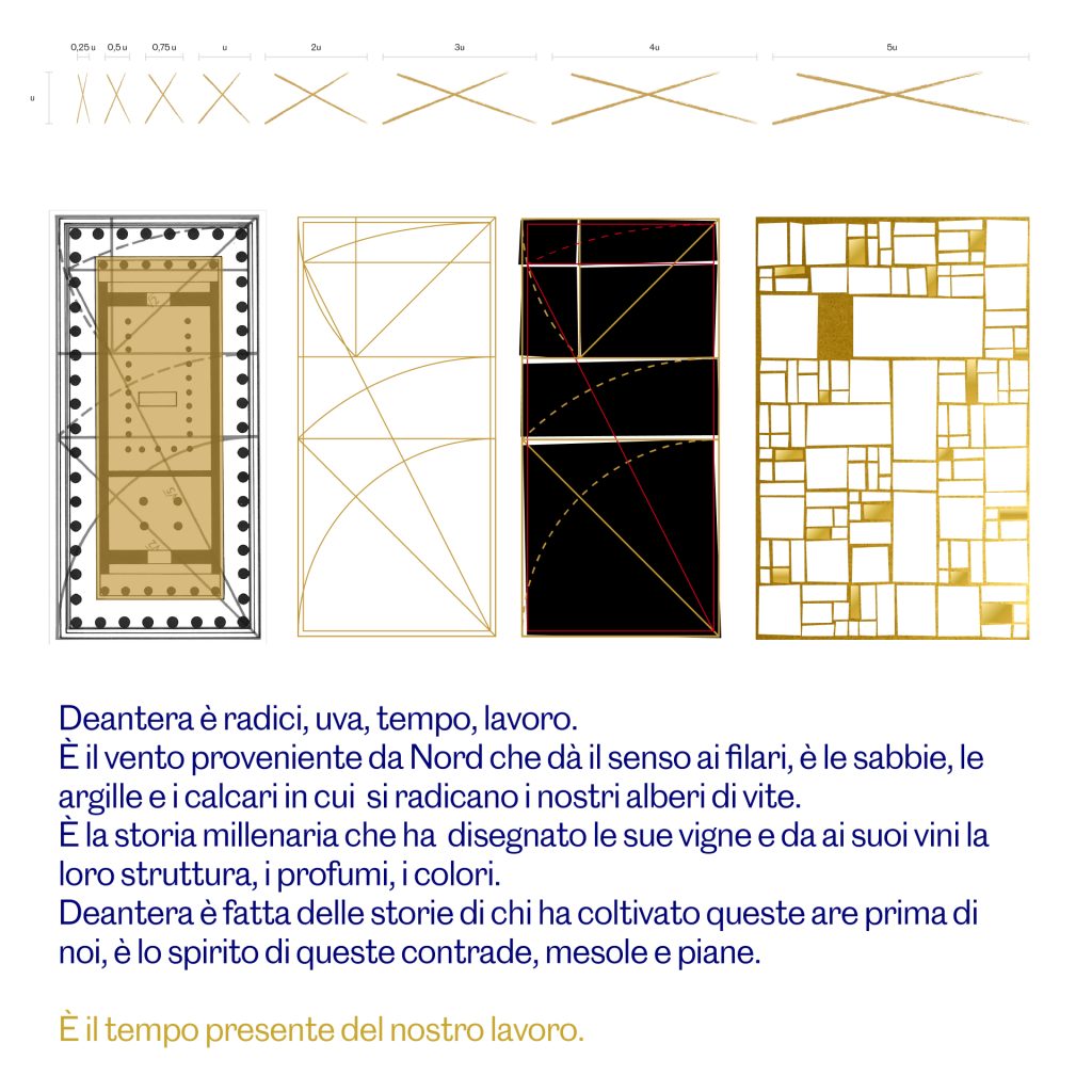
The entire set of first labels and packaging follows the idea of abstracting this concept, making the geographic symbols and the shape of the fields a geometric and compositional matrix.
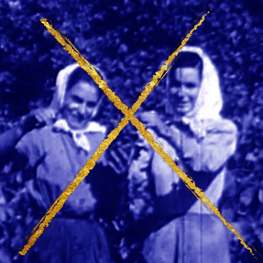
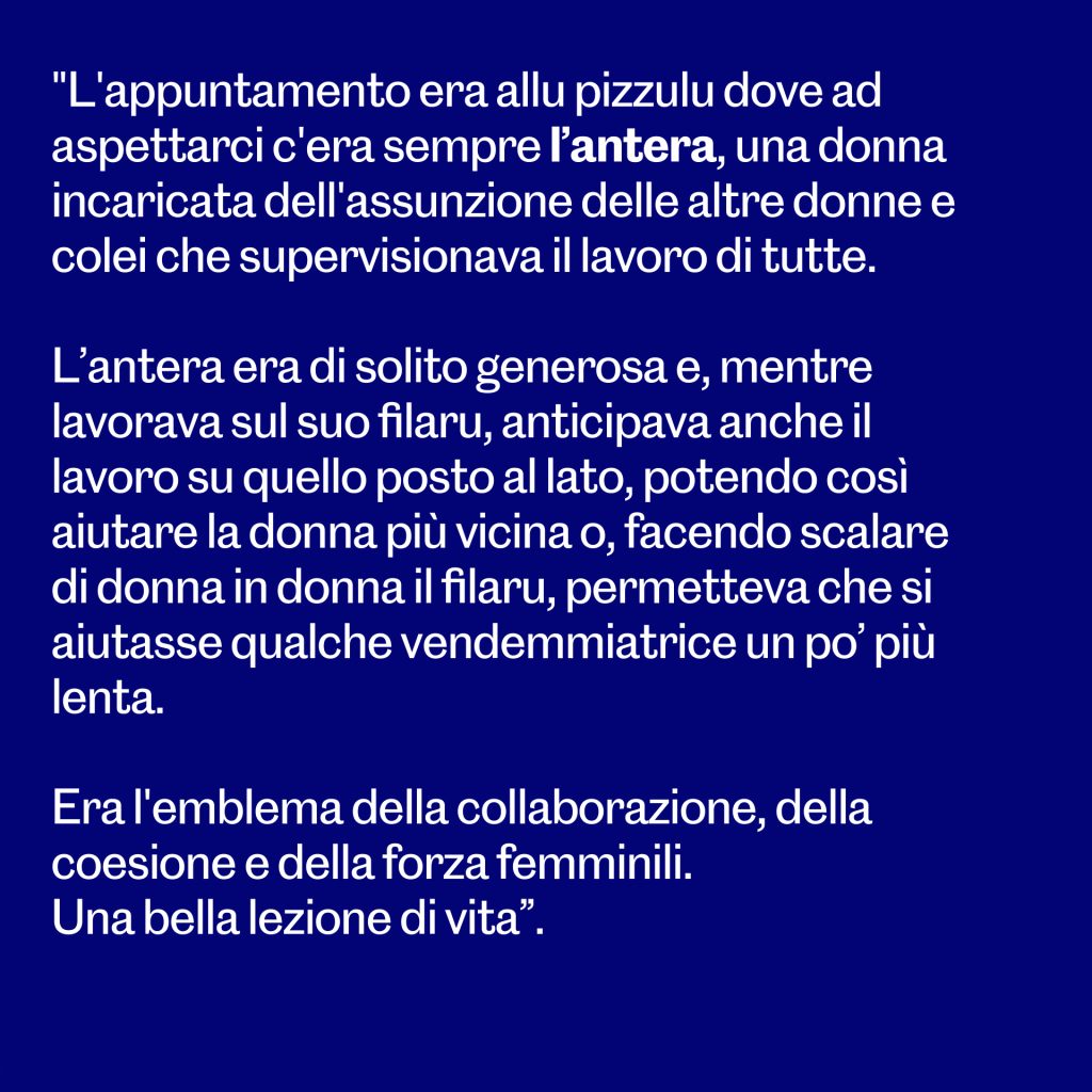
Then, the name of a woman, real and symbolic. No coat of arms, nor noble emblem, but a simple cross sign: the most common signature possible, often typical of those who have nurtured and sustained those noble riches with hard work.
For the logotype, we worked with a beautiful Didot Modern by Arnaud Chemin x Nouvellenoire, the rest is in our beloved and only possible font Caslon Doric by Commercial Type.