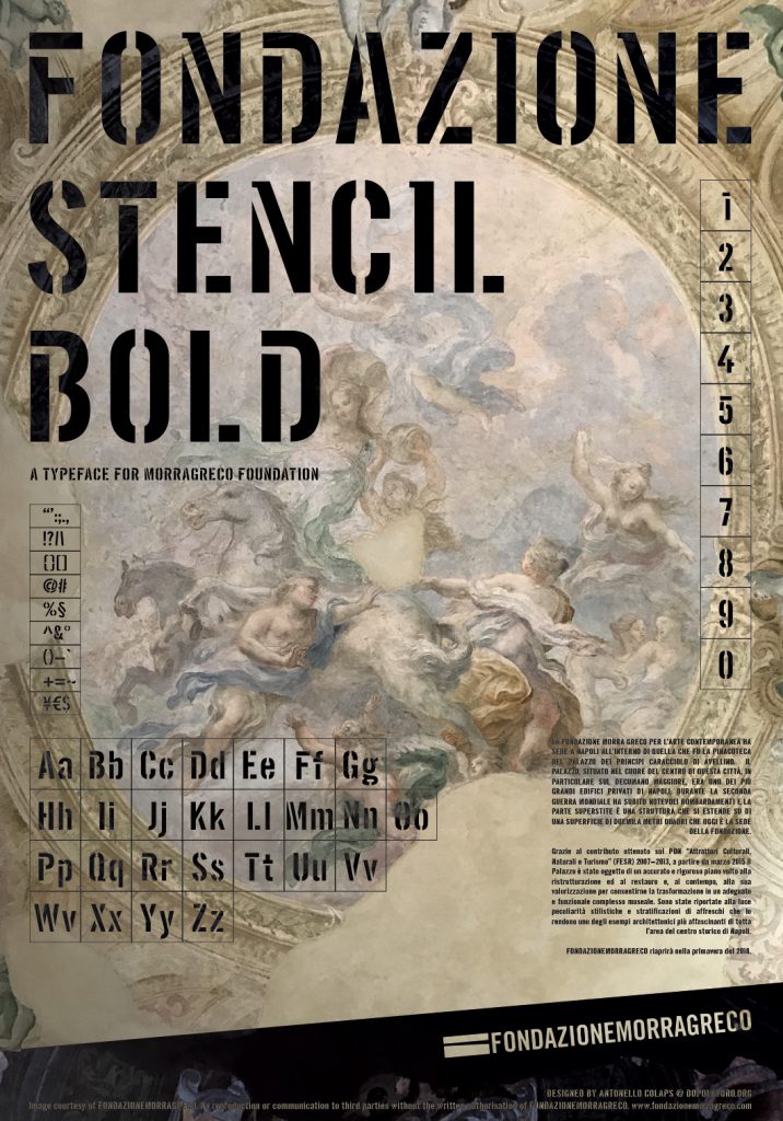
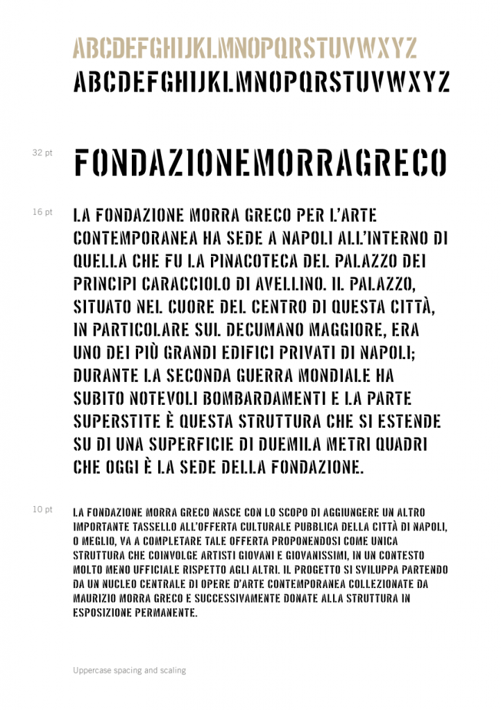
Fondazione Stencil Bold
Nov 2017
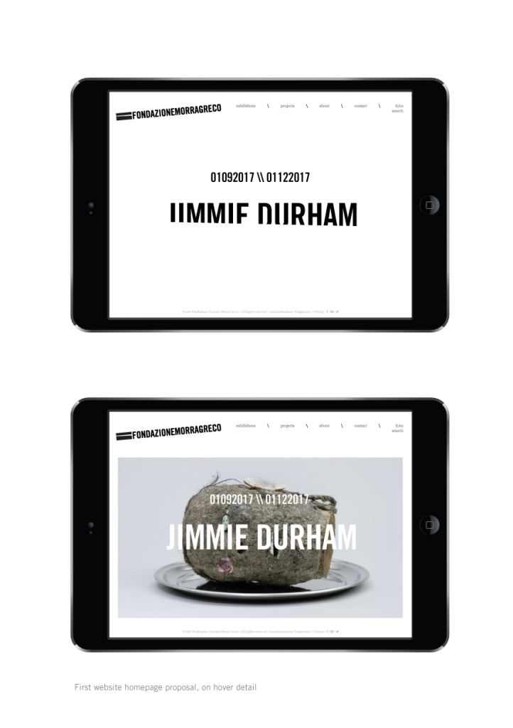
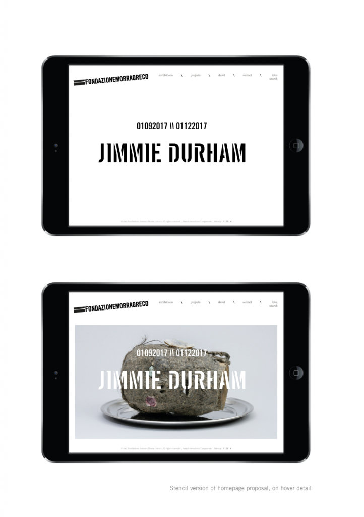
In July 2017, Morra Greco Foundation asked us to design their new website. The starting point was only their mark, nothing more.
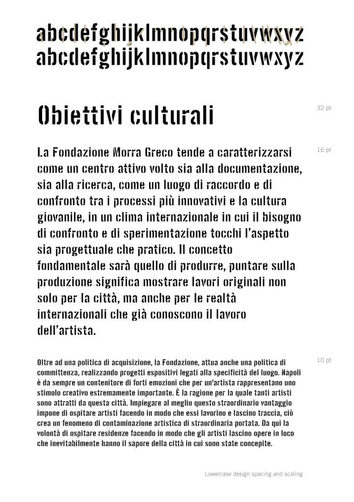
In order to build a new communication asset, as adaptive and flexible as the contemprary communication requires, we had to create a system of rules to build up a stronger Brand Identity. Before talking (or writing), we had to design our letters, build up our words and their meanings, make all distinguishable as unique.
We started searching (and finding) a font-family that could offer some variations to the mark’s one. Soon after the logo has been slightly refreshed, adding some compositive rules that would be useful not only on web pages, but for a proposal of global communication.
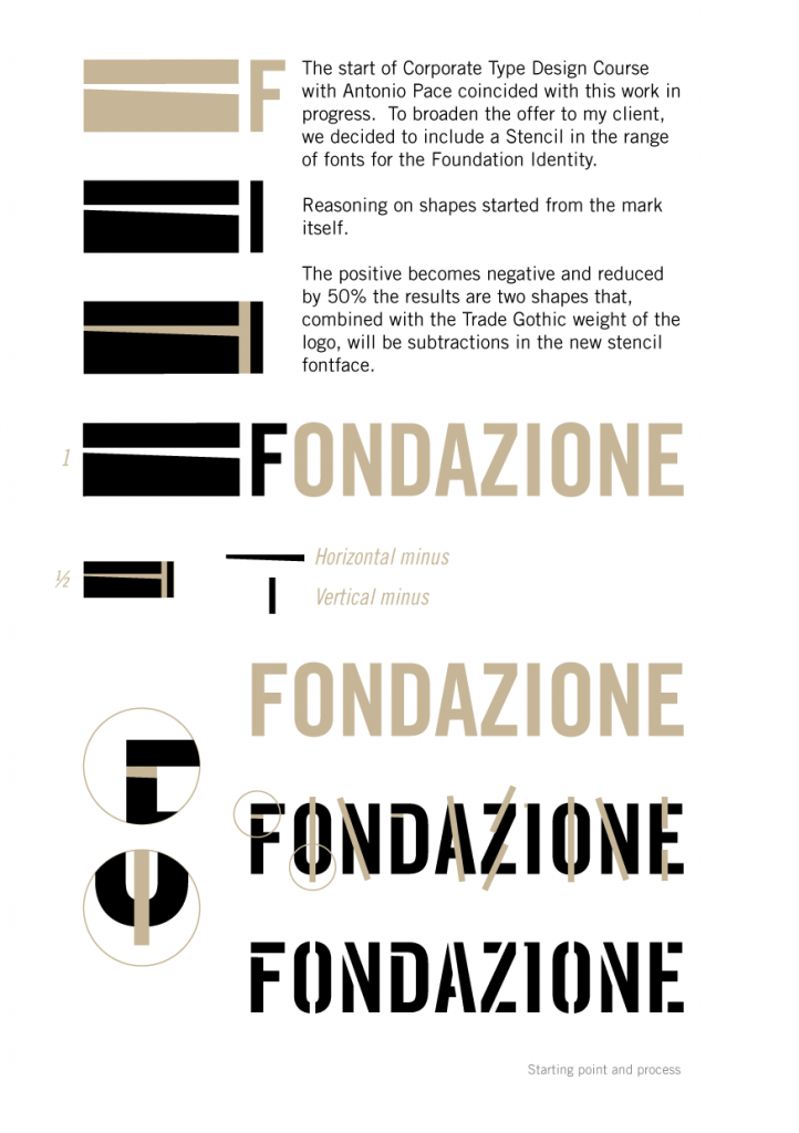
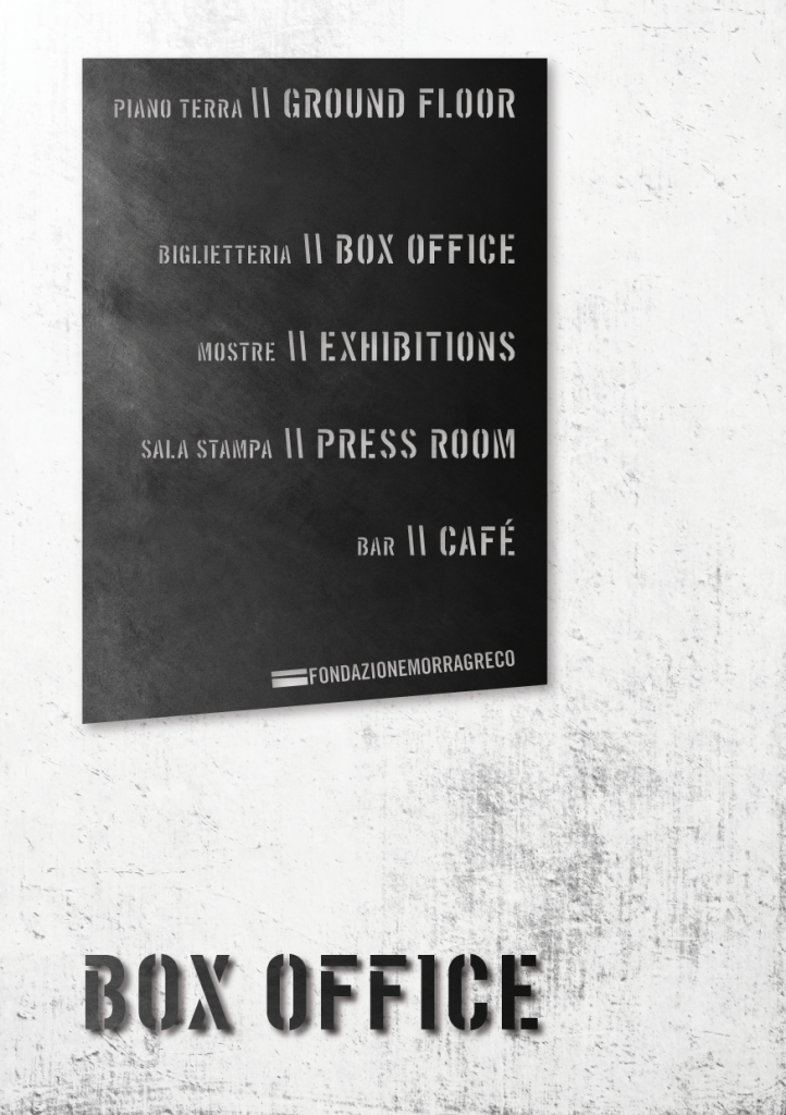
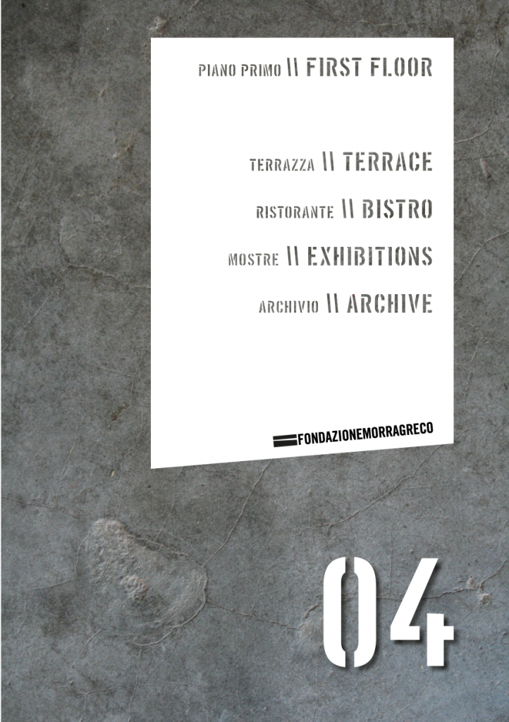
The starting of a Corporate Type Design Course with Antonio Pace coincided with this work (still) in progress. To broaden the offer to the client, we decided to include a Stencil in the range of fonts for the Foundation Identity.
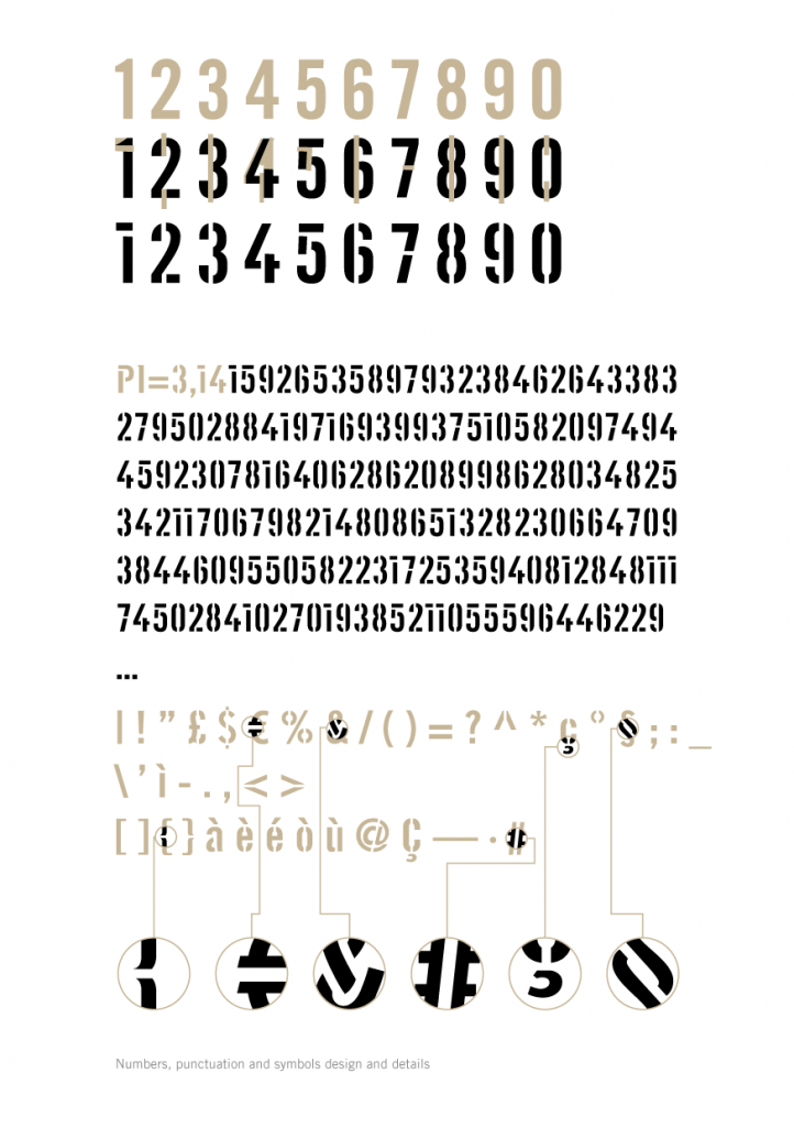
Reasoning on shapes started from the mark itself.
The positive has become negative and, reduced by 50%, the results are two shapes that combined with the Trade Gothic weight of the logo will be subtractions in the new stencil fontface.